Archetypes Series: The Knight & Damsel
Project Scope
This was a school project where I had to create a series of paintings based on a concept of my choosing. Each painting had to be carefully designed to closely represent the concept; meaning every decision, from the composition to the color scheme to the painting style had to be justifiable based on the concept.
This was my letter of intent:
"I'm interested in exploring archetypes and their meanings. Each archetype says something about human nature. Each one has a positive and a negative side. I'm interested to find ways to visually show what each archetype represents in a familiar way, such as portraiture. We all know what portraits are and what they generally look like. Presenting each archetype as a portrait would be an interesting way of personifying the significance of each in a visually interesting and personable way.”

Research
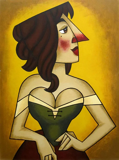
Subjects: Most of my information came from Caroline Myss' site. The information you'll find below is taken from her site. I read about dozens of archetypes and ended up narrowing down my list to these five: Queen, Fool, Prostitute, Knight and Damsel.
Knight
"The Knight archetype is primarily associated with chivalry, courtly romance, protection of the Princess, and going to battle only for honorable causes. The Knight serves his King or Lord and so this archetype has spiritual overtones as well of service and devotion. Loyalty and self-sacrifice are the Knight's great virtues, along with a natural ability to get things done."
Damsel
“[The Damsel] is always beautiful, vulnerable, and in need of rescue, specifically by a Knight and, once rescued, she is taken care of in lavish style. When disappointed, a Damsel must go through a process of empowerment and learn to take care of herself in the world. The shadow side of this archetype mistakenly teaches old patriarchal views that women are weak and teaches them to be helpless and in need of protection. It leads a woman to expect to have someone else who will fight her battles for her while she remains devoted and physically attractive and concealed in the castle.The [Damsel] is more often associated with romance rather than distress. She awaits a Knight who is worthy of her beauty and rank and will take her not to his castle but to a palace.”

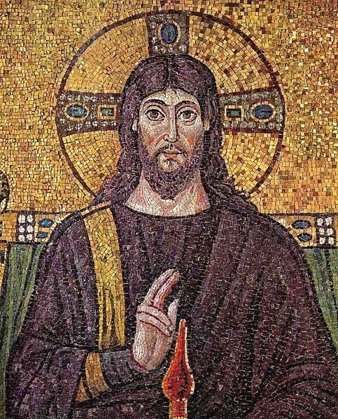
Before I began to develop each archetype, I looked at a variety of things to get some inspiration from. I looked at classic and modern portraits of royalty, Byzantine and religious art, medieval paintings, tarot cards, fairytale illustrations, Pre-Raphaelite paintings, stained glass art, classic Disney princesses, portraits by Tamara de Lempicka, Frida Kahlo, Sofonisba Anguissola, Boticelli, J. C. Leyendecker, Toulouse-Lautrec, and a few others. I looked at everything I could think of that could help me design each character, choose a pose, inspire a style, etc.


References
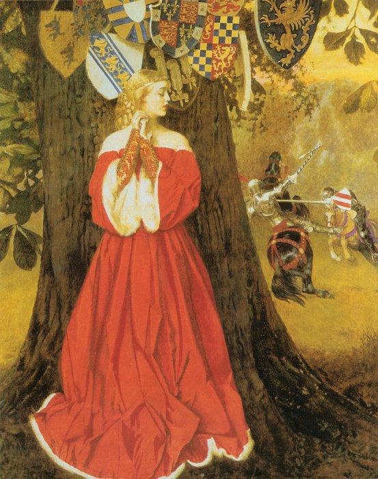
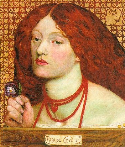
I have a lot of fun finding references for this piece. I was most inspired by paintings by the Pre-Raphaelites and a few of J. C. Leyendecker's works, too. The Pre-Raphaelites truly captured and romanticized the Knight and Damsel archetypes. J. C. Leyendecker's subjects are placed in a more modern setting, as his works were mostly advertisements, but the effect is the same.


Thumbnails
Initially I thought of creating a dramatic scene where the Knight has saved the Damsel and they are having a romantic moment, or the Knight has to leave the Damsel in order to fulfill his oath to the King and the Damsel is in distress thinking of being separated from her Knight.

Roughs
This was the last piece I developed, so by the time I reached the rough stage I already knew the style and direction the series would go in. Because of that I didn't need to spend much time exploring compositional ideas. It was clear to me that the portrait would work best if there wasn't very much interaction between the archetypes. Instead, each archetype would stand on its own, representing itself individually.

Compositional Development
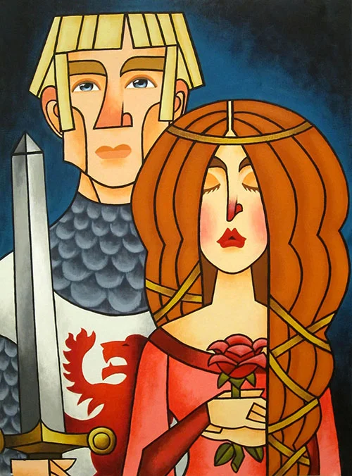
The Damsel was fairly easy to design. I based her design heavily on the quintessential Pre-Raphaelite damsel with her thick, long hair, melancholic expression and shapely lips. The red rose she holds is a symbol of romantic love, which she holds onto with unrelenting devotion. Her eyes are closed and she looks as if she's praying for her Knight to come home safely. The Damsel is completely dependent on the Knight, so she will suffer alone and remain loyal to him while he's absent.
The knight was slightly harder to design. He is supposed to represent chivalry, honor, male ruggedness, and courage. I began by watching The Last Unicorn and The Sword in the Stone for inspiration. This helped me get an idea of the character a Knight is supposed to have. I decided to make him as statue-like as possible to emphasize the physical and mental strength a Knight is expected to have. He needs physical strength to slay dragons and fight in battle and mental strength to put all his personal interests aside in favor of his oath to the King.
I was very happy with my decision to make his head flat, which in my opinion is the perfect visual representation of the Knight's fixed resolution to fulfill his duty. His expression is blank, showing the rock-like steadiness that's expected of him. He holds up his sword, which is a symbol of his role and a crucial part of his identity.
The Knight and Damsel have a pretty tragic dynamic, when you think about it. The Damsel is hopelessly devoted to the Knight, while the Knight is resolutely devoted to his oath.

Color Breaks
Choosing a color scheme for this piece was relatively easy now that I'd chosen the other three in the series. I chose blue as the background because I felt it lends itself well to the rather glum theme of this piece.


I initially wanted the Damsel's gown to be green or purple because those colors would contrast nicely with her red hair, but I was indecisive because I'd already chosen green for the Prostitute and I thought purple (which is a traditionally royal color) would compete with the Queen's red gown. So I decided on pink to symbolize the Damsel's youth and emotional immaturity.

Rendering Process
Now that I knew what color scheme I wanted, I made a quick color reference on paper before I started painting the actual thing on illustration board. I didn't use paint straight from the tube, so making the color reference was helpful in letting me test out different color combinations. That way I had a good idea of which colors and how much of them I would need for the actual painting.
I used illustration board with several coats of gesso. You do not need to gesso your painting surface when you're using acrylic paint, but I'd already primed my boards ahead of time because I originally though I'd be using oils (which do require a primed surface). Illustration board is a bit pricey and the gesso wouldn't really have an effect on the acrylic paint, that's why I decided to use my primed boards.
Color Palette: I used Grumbacher student grade acrylic paints (note I did not use every color on every painting).
cadmium red light
alizarin crimson
yellow ochre
naples yellow
cadmium yellow light
cerulean blue
ultramarine blue
titanium white
ivory black
Painting Process: First, I used a projector to trace my final design onto my board with a pencil.
Working with acrylic paint meant I had to work fast before my paint dried, so I made sure I was ready to sit and paint for a while before I mixed any colors. I mixed each color one at a time, making sure I mixed enough for two-three coats for good opacity. It was a lot like painting by numbers.
I painted all the base colors first, then did the shading and highlights individually and finally painted the outlines using a very thin brush. Note that the outlines also required two-three coats of paint. (This last step was very nerve-wracking because if I made any noticeable mistakes it meant I would have to mix one or more colors again and try to match the original shade, which is very hard to do when acrylic paint always looks a little lighter when it's wet than when it's dry!)