Archetypes Series: The Prostitute
Project Scope
This was a school project where I had to create a series of paintings based on a concept of my choosing. Each painting had to be carefully designed to closely represent the concept; meaning every decision, from the composition to the color scheme to the painting style had to be justifiable based on the concept.
This was my letter of intent:
"I'm interested in exploring archetypes and their meanings. Each archetype says something about human nature. Each one has a positive and a negative side. I'm interested to find ways to visually show what each archetype represents in a familiar way, such as portraiture. We all know what portraits are and what they generally look like. Presenting each archetype as a portrait would be an interesting way of personifying the significance of each in a visually interesting and personable way.”

Research
Subjects: Most of my information came from Caroline Myss' site. The information you'll find below is taken from her site. I read about dozens of archetypes and ended up narrowing down my list to these five: Queen, Fool, Prostitute, Knight and Damsel.
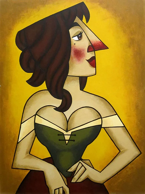
Prostitute
"The Prostitute archetype engages lessons in integrity and the sale or negotiation of one's integrity or spirit due to fears of physical and financial survival or for financial gain. This archetype activates the aspects of the unconscious that are related to seduction and control, whereby you are as capable of buying a controlling interest in another person as you are in selling your own power. Prostitution should also be understood as the selling of your talents, ideas, and any other expression of the self--or the selling-out of them. This archetype is universal and its core learning relates to the need to birth and refine self-esteem and self-respect."

Before I began to develop each archetype, I looked at a variety of things to get some inspiration from. I looked at classic and modern portraits of royalty, Byzantine and religious art, medieval paintings, tarot cards, fairytale illustrations, Pre-Raphaelite paintings, stained glass art, classic Disney princesses, portraits by Tamara de Lempicka, Frida Kahlo, Sofonisba Anguissola, Boticelli, J. C. Leyendecker, Toulouse-Lautrec, and a few others. I looked at everything I could think of that could help me design each character, choose a pose, inspire a style, etc.


Note
I chose to illustrate the Prostitute because I found her to be one of the most interesting and complex archetypes out there. Like I said before, archetypes represent universal truths about human nature. That's not to say that all humans are prostitutes in a literal sense.
The Prostitute doesn't just represent the selling of sexual favors for compensation. She represents any act (including non-sexual acts) in which one compromises their integrity for survival or financial gain, which we have all done probably more than once in our lives. If you think about it, it's a very human thing to do.
As Myss explained, in this context "Prostitution should also be understood as the selling of your talents, ideas, and any other expression of the self--or the selling-out of them. This archetype is universal and its core learning relates to the need to birth and refine self-esteem and self-respect."

References
For the Prostitute I looked at works by Toulouse-Lautrec, Tamara de Lempicka, Manet, etc. I wanted to understand how prostitutes and women working in night-life entertainment had been portrayed in the past. I also wanted to see examples of women portrayed using their beauty and sexuality as a source of power.


I was particularly inspired by John Singer Sargent's painting Madame X. I've always loved Madame X's glaringly pointy nose, which wasn't seen as an attractive feature but Sargent chose to highlight anyway because it was an integral part of her identity. The original version of this painting, which was very controversial, featured one of the lady's dress straps hanging loosely off her shoulder, which hinted at her devious reputation.
What I like most about the painting is the powerful and confident way in which she is portrayed. Sargent didn't attempt to mask who she was or try to make her seem apologetic. Instead, she holds her head up with pride and poses seductively for everyone to see.

Thumbnails
Early on I decided to avoid picturing my Prostitute nude. I felt nudity would bring on stronger sexual connotations than were unnecessary, as well as risk making the series as a whole offensive to some. Because the Prostitute archetype is universal I knew there had to be a way to portray the archetype in a way that was recognizable and even relatable.


I tried different ideas where the Prostitute would look flirty and proud or even pensive and standoffish. In the end I decided didn't want to portray her as someone to be pitied or feared. It was important for me to avoid adding a personal commentary to the image. I wanted the portrait to be as objective as possible, simply presenting the audience with an image of the archetype and allow them to make their own deductions and opinions.

Roughs
At first I focused on placing the Prostitute in a saloon or Moulin Rouge kind of setting. For her pose I wanted her to look as if she'd been approached in the middle of a regular day and asked to sit for a portrait. I asked myself, how would she choose to pose? How would she want to be perceived?


Once I'd developed the Queen and Fool's compositions I knew picturing the Prostitute in a saloon or Moulin Rouge setting would deviate too much from the existing designs. So I started to rework the Prostitute's design with the Queen and Fool's designs in mind.

Compositional Development
I started out picturing the Prostitute in a way that was very reminiscent of Sargent's Madame X, exaggerating her nose and letting one of her sleeves hang loosely down her shoulder. I felt she looked too one-dimensional and needed more personality, so I tried giving her a slightly sassier attitude and more animated facial features.
I worried that her role as a prostitute wouldn't be clear enough, so I emphasized her cleavage, lifted her head up a bit to make her appear prouder, loosened her hair, and placed one hand decisively on her hip and the other trailing down in a vaguely suggestive way.

Color Breaks
I initially tried out a variety of color schemes without feeling satisfied. I considered using yellow against a jarring red to make the painting more dramatic but it felt too disconnected from the Old Masters palette I'd decided on for the series. I tried out a few more ideas and ended up choosing a golden yellow for the background, which would allow her distinctively angular silhouette to stand out.


Rendering Process
Highlighting the Prostitute's silhouette became a priority when I realized that in her case, her clothes weren't as important as her posture and body language. While the Queen's dress and jewelry strongly define her role, what the Prostitute does or doesn't wear isn't essential to her identity. Because of this the Prostitute's garments are neutral in color and rather understated. Note you'll find yourself more interested in her cleavage and her nose than in her dress.
I used illustration board with several coats of gesso. You do not need to gesso your painting surface when you're using acrylic paint, but I'd already primed my boards ahead of time because I originally though I'd be using oils (which do require a primed surface). Illustration board is a bit pricey and the gesso wouldn't really have an effect on the acrylic paint, that's why I decided to use my primed boards.
Color Palette: I used Grumbacher student grade acrylic paints (note I did not use every color on every painting).
- cadmium red light
- alizarin crimson
- yellow ochre
- naples yellow
- cadmium yellow light
- cerulean blue
- ultramarine blue
- titanium white
- ivory black
Painting Process: First, I used a projector to trace my final design onto my board with a pencil.
Working with acrylic paint meant I had to work fast before my paint dried, so I made sure I was ready to sit and paint for a while before I mixed any colors. I mixed each color one at a time, making sure I mixed enough for two-three coats for good opacity. It was a lot like painting by numbers.
I painted all the base colors first, then did the shading and highlights individually and finally painted the outlines using a very thin brush. Note that the outlines also required two-three coats of paint. (This last step was very nerve-wracking because if I made any noticeable mistakes it meant I would have to mix one or more colors again and try to match the original shade, which is very hard to do when acrylic paint always looks a little lighter when it's wet than when it's dry!)