

Understand The Basics Of Color Theory

Color theory is one of the basic philosophies every artist can benefit from in developing their skills. Color theory helps you understand color mixing, how to critique your work and others' constructively and how to choose appealing color palettes.
NOTE: This is the conventional way of teaching color theory, which is used in most art schools. Although it works, technically it is incorrect, as it was pointed out in the comments. For a more scientifically accurate and in-depth look at color theory, I recommend you watch Scott Naismith's video Colour Theory: The Truth About The Colour Wheel
Color Mixing
It’s important for you to know how to mix your own colors to create appealing color palettes. It’s also cheaper than buying a tube of paint for every color.
create your own color wheel
1. Primary Colors
All other colors can be created by mixing these in different ways.
- red
- blue
- yellow
Note: mixing all three will create brown.
2. Secondary Colors
Created by mixing primary colors.
- purple (red+blue)
- green (blue+yellow)
- orange (yellow+red)
3. Tertiary Colors
Created by mixing a primary and a secondary color.
- red-orange
- red-purple
- blue-purple
- blue-green
- yellow-green
- yellow-orange

Basic Color Theory Terms
Knowing these therms will help you understand and talk confidently about color theory.
Hue
A hue is the name of a color.
Ex. red, blue, green, yellow, and orange.
Saturation
Saturation refers to the intensity or purity of a hue.
- High saturation means the color looks really bright
- Desaturation means the color looks washed out or greyed out
Value
Value refers to the degree of lightness or darkness of a hue.
- A value scale represents a wide range of values
Shade
A shade is a hue produced by adding black.
- Here you have a variety of shades of red, made by mixing red with increasing amounts of black.
Tint
A tint is a hue produced by adding white.
- Now you have a variety of red tints created by mixing red with increasing amounts of white.
Tone
A tone is a hue produced by adding grey.
- Now you have a variety of red tones produced by mixing red with increasing amounts of grey.

Color Temperature
Opposite temperatures create visual contrast and have different psychological effects.
Warms
Generally perceived as bright, cheerful, and happy.*
- reds
- oranges
- yellows
Cools
Generally perceived as dark, mysterious, and gloomy.*
- purples
- blues
- greens
*This is not always the case. It really depends on how you present the colors.

Color Schemes
The color wheel is a great reference in helping you choose an appealing color scheme. Some of the most common types of color schemes include:
Monochromatic
Made up of one hue plus white, grey or black, which creates a variety of tints, tones, and shades.
Complementary Colors
These colors sit across from each other on the color wheel.
- red & green
- purple & yellow
- orange & blue
Putting these next to each other creates great contrast and visual interest.
They can easily overpower each other, though, so it’s important to use them carefully.
Analogous Scheme
Made up of 2-4 colors sitting next to each other on the color wheel.
These are a few examples.
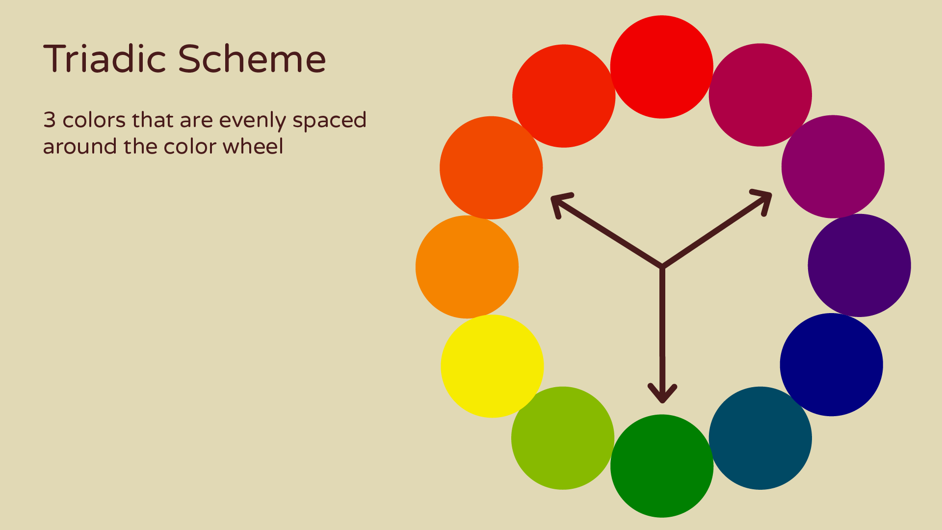
Triadic Scheme
Made up of 3 colors that are evenly spaced around the color wheel.
These are a few examples.


Split-Complementary Scheme
Made up of a base color plus the two colors adjacent to its complementary color.
These are a few examples.


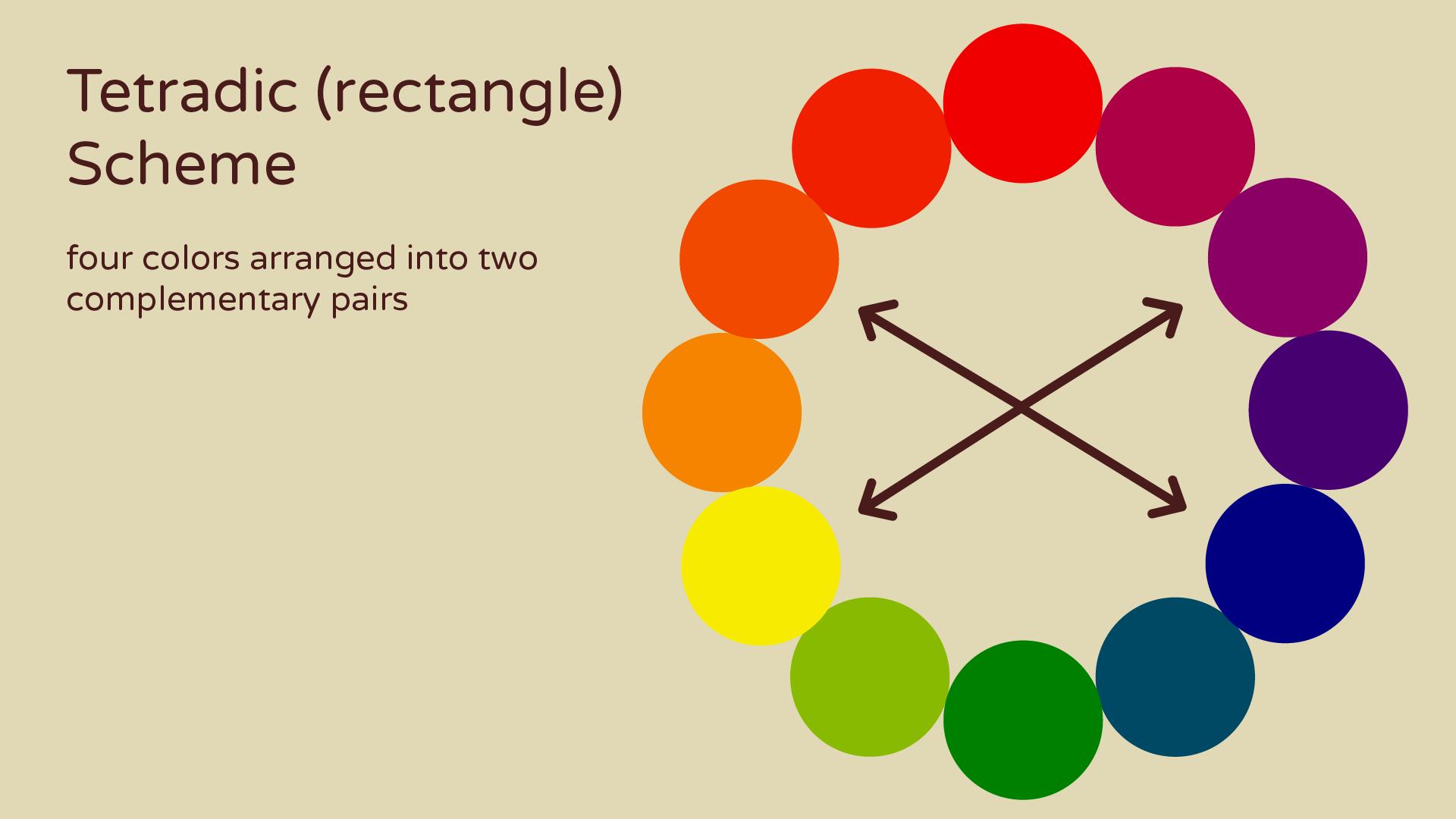
Tetradic (rectangle) Scheme
Made up of 4 colors arranged into 2 complementary pairs.
These are a few examples.


Square Scheme
Made up of 4 complementary colors evenly spaced around the color wheel.
these are a few examples.


Don’t worry if this seems like a lot of information. It is and you probably won’t be able to retain it all at once and that’s totally fine. You can reference this page or video as often as you need to while you’re working on things.
References
I don’t know all of these terms by heart either, so I used a couple of references in putting this post together.
Design Principles and Problems second edition by Paul Zelanski and Mary Pat Fisher
The good news is now that you have a basic understanding of color theory we can start talking about how to apply these theories to your work! So there are lots of new fun tutorials and art tips coming soon, like color mixing (where I will actually teach you how to mix painting palettes) and how to choose a color scheme for your work!
As always, if you have any questions or suggestions, please leave me a comment or send me an email. I’d love to hear from you!
Related:
Tutorial #9: Choosing A Color Scheme

