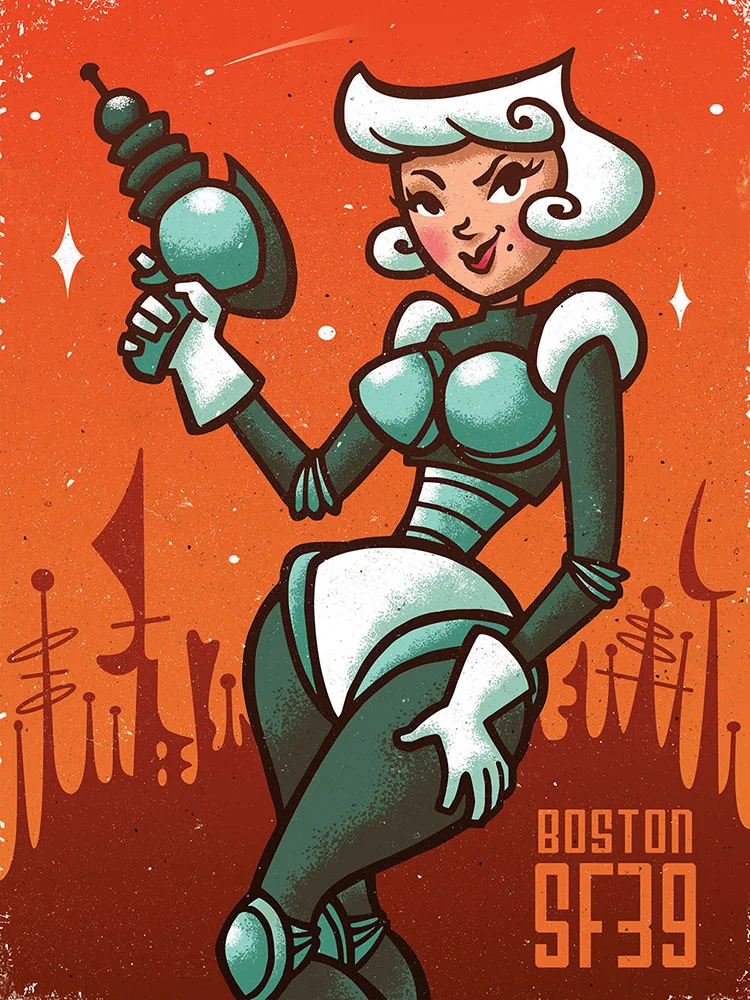
Astrid/ SF39 Poster

Project Scope
As one of my last school projects, I was assigned a theoretical souvenir poster design for the 39th Boston Science Fiction Film Festival.

Research
What: The Boston Science Fiction Film Festival and Marathon (“Boston SciFi”) is an 11-day cinematic event. The first nine days consist of a film festival that emphasizes emerging directors with distinct visions from around the globe. The Festival concludes with The Marathon (a.k.a., “The ‘Thon”), a 24-hour orgiastic motion picture endurance test featuring classic, new and schlock films. Think of it as binge viewing with 700 close friends. It starts at noon on the 15th and ends at noon on President’s Day. (source)
Who: The target demographic for the poster were males 40-50 years old with a love of classic sci fi films.
When & Where: The festival is held every year in February at the historic Somerville Theater in Somerville, Massachusetts.
Additional Notes: The festival has been running for (as of 2014) 39 consecutive years. It's composed of a close-knit community of sci fi fans. Most of the attendees have been attending for many years. In their own words they describe themselves as "700 close friends". The event is a big light-hearted celebration of science fiction filmography, as well as a platform for up and coming filmmakers.
Trailer for the 38th installment of Boston's Sci-Fi Film Marathon

References
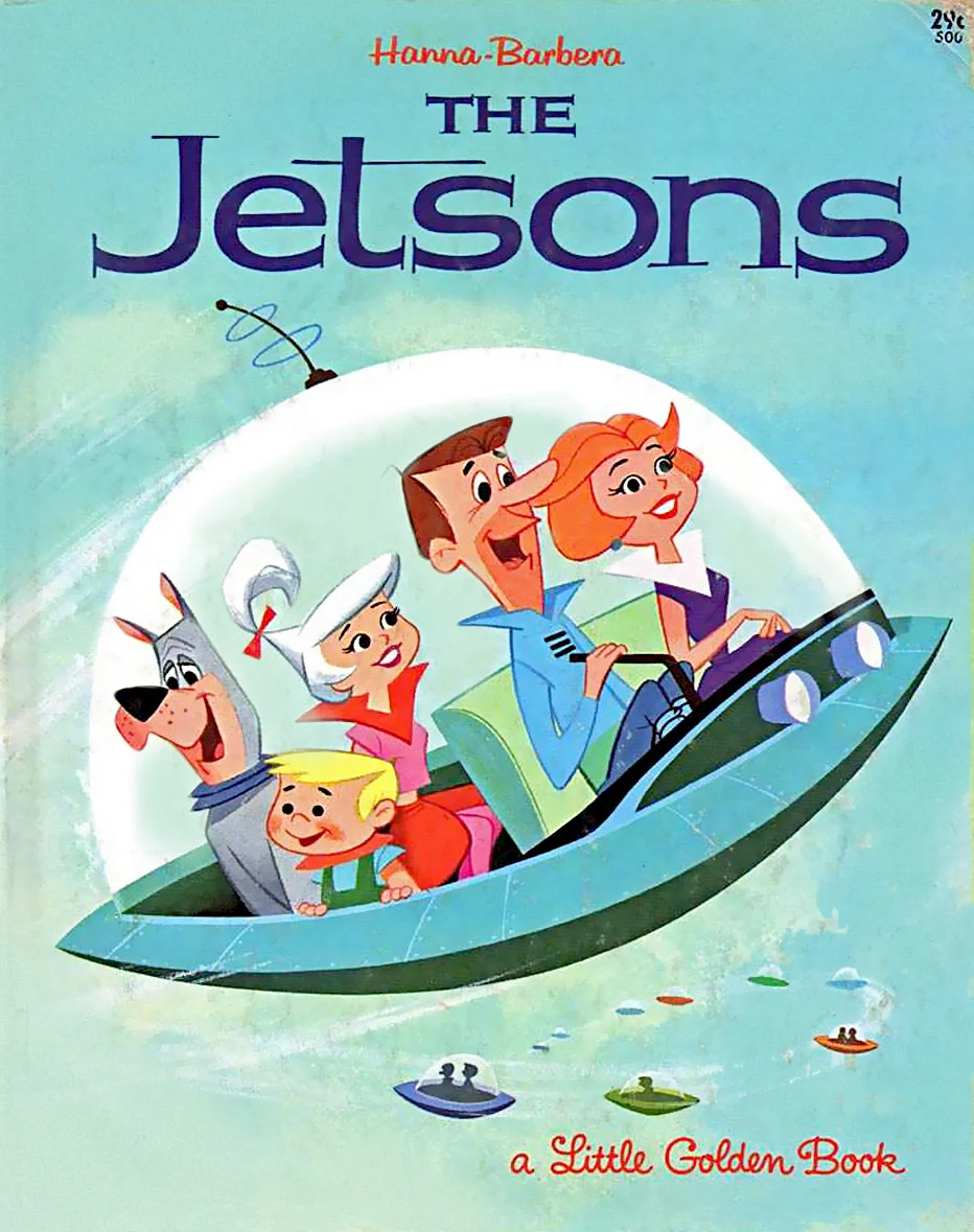
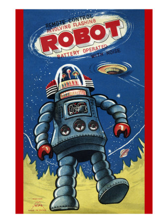
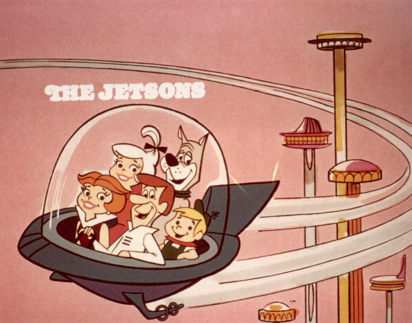
I looked at existing posters for past Boston Science Fiction Film Festivals, retro atomic art, classic sci fi toys, posters of classic sci fi films, other sci fi related illustrations, art for the cartoon series The Jetsons, pin-ups, , etc.
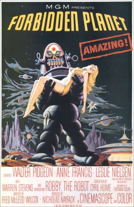
I also enjoyed watching The Day The Earth Stood Still (1951) and Forbidden Planet (1956) to get a sense of science fiction films as they were in their infancy.


Gathering all these references (and more) helped me brainstorm a wide variety of ideas for the poster. I found styles, compositions, color schemes, common themes, and various look-and-feel ideas to work with.

Thumbnails
I started by making 30 quick thumbnail sketches to get as many different ideas down as possible. I didn't spend more than a few minutes on each.

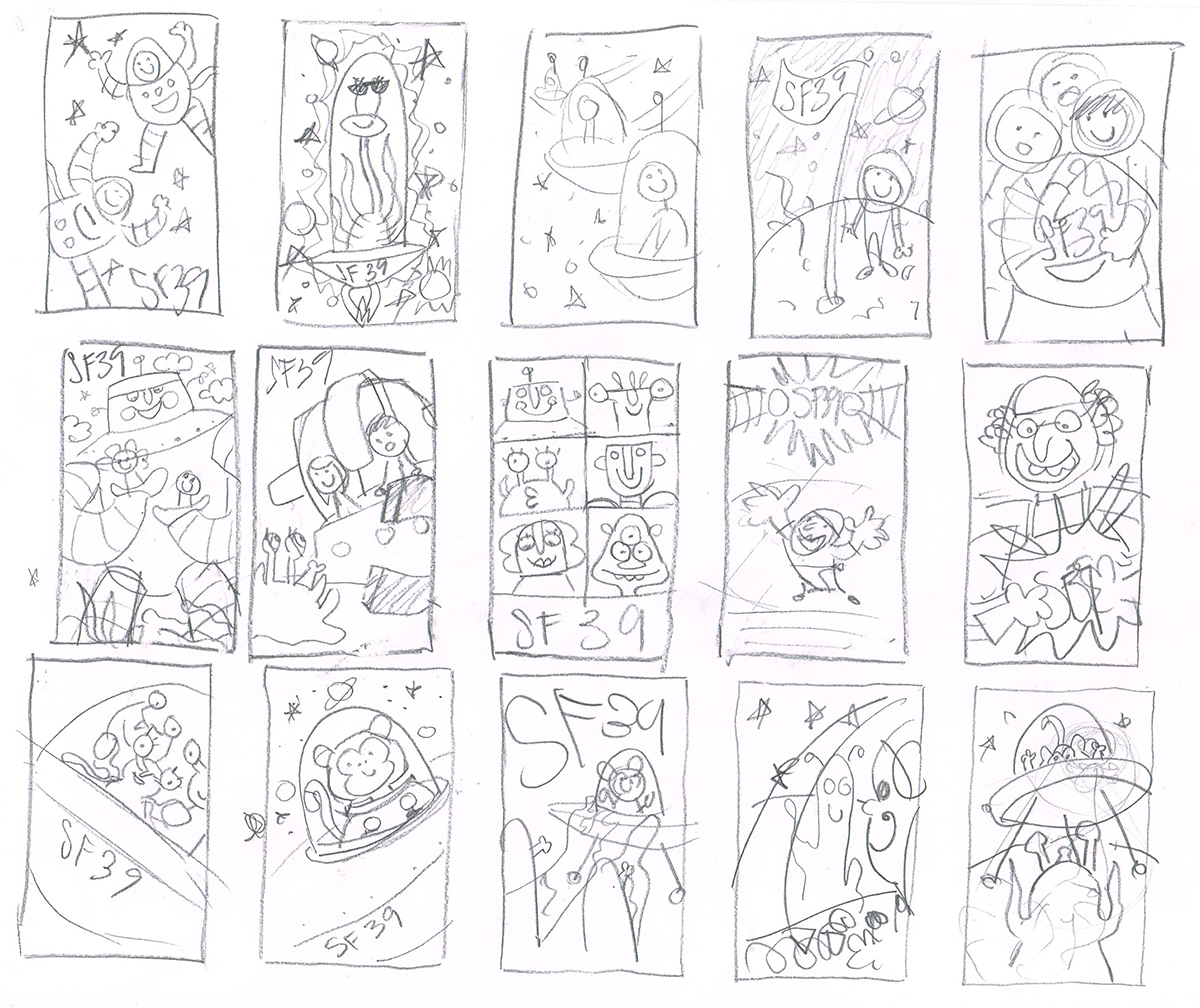
I considered using robots, aliens, astronauts, a monkey, and an evil scientist as main characters for most of these.

Exploration
I liked the idea of a giant friendly robot. I picked my favorite thumbnail featuring the friendly robot from the batches above and began exploring ideas for his design (left). I also started to consider doing a pin-up poster at this time, because I felt that it would resonate with the target demographic’s interest in classic sci fi films, whose posters and cover art generally featured a pin-up damsel in distress. So I began exploring ideas for a sassy female character (right).


At the same time I began sketching more thumbnails exploring ideas that could incorporate the friendly robot and pin-up space girl I was growing fond of.

Character Development
I tried out a few more ideas for the design and composition of the friendly robot I'd been working on. I felt the first two below were a bit too friendly for the target demographic, so I made the robot tougher-looking in the third sketch and gave him a ray gun, as well as presented him at a more dramatic angle.
I also continued to develop my space girl. The more I worked on her suit the more robotic it appeared, so she transformed into more of a cyborg than a human in a space suit.
I ultimately decided to stick with the pin-up idea instead of the friendly robot. I felt that the robot wasn't the right solution for the target audience. I felt the robot was still a bit too childish in nature, even after I tried to toughen him up. It seemed to me that the robot would hold little sentimental value for the target audience, while the pin-up would create a strong and direct connection with the audience's love of classic sci fi films. In the end it was simply a matter of asking myself, what would a 40-50 year old male/sci fi nerd rather look at on his wall, a sexy pin-up or a cute robot?


Compositional Development
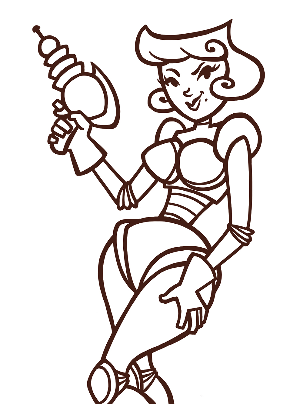
I chose the last thumbnail I sketched and continued to clean up and tighten the design. I also decided to name this character Astrid in the process. (The name wasn't relevant to the project. I just enjoy naming all my characters. It's like they become my friends through the development process and I end up feeling a bit attached to each one.)
Here you can see the transitions between thumbnail, rough, and tight sketch. I worked on the first two with pencil and paper, then scanned in the rough sketch and added more detail to Astrid's design, refined her pose, cleaned up and adjusted the background, and added the final touches to the overall design in Photoshop. In this case I preferred doing it this way. In other occasions I rely more on using pencil and paper (and tracing paper).

Color breaks
I didn't have a very clear idea of the color scheme I wanted to use at this point, so I made color breaks to explore some variations.
I began with Metroid in mind, then decided to go for something more retro-inspired. I chose to stick to a limited palette (fewer colors) to add to the retro feel. Following this guideline, I tried out a few different ideas until I got one that I felt was the right one.

Rendering Process
I knew I wanted the line art to have an organic look to it, so I worked on the line art in Photoshop. Photoshop brushes allow you to control line sensitivity (varying the width), using a pen tablet, in a more organic way than Illustrator. Because I knew I wanted the background to have a more geometric or robotic look to it, I created the background in Illustrator using the pen tool.

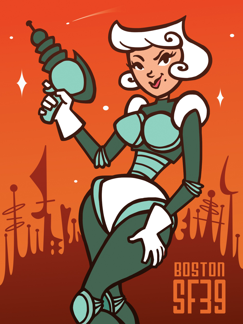


I then merged the line art and background in Photoshop and proceeded to add the base colors.
It's worth mentioning that it took a lot of searching online and looking at various tutorials, etc. to find the right brush to use for the opaque spatter effect I used in the shading. At first I thought I'd find a brush online, but after looking at various sources, I wasn't able to find the right kind of brush. However, I gathered enough information to help me decipher how to create the brush I wanted myself. The solution was almost too simple. I used a default Photoshop spatter brush and set the contrast to 100% under brush presets to create the effect.
This goes to show sometimes finding a solution requires you to look at various tutorials to gather the information you need to come up with your own solution. It's certainly a great way to develop your creative problem-solving skills!
Anyway, once Everything was done, I added a few finishing touches in the form of subtle grunge textures and paint splatters to make the poster look vintage and a little worn from use.
I admit I'm not particularly knowledgeable in the subject of typography or poster design, but that doesn't mean squat. With a little research, any problem can be solved. So, I based myself on trends I saw in the classic sci fi movie posters I referenced and on previous Boston Science Fiction Film Festival posters. I noticed that the previous posters for the event, for the most part, simply added SF and the number of consecutive years somewhere in the lower section of the poster.
For typography, I noticed most posters used typefaces that were bold and, for lack of a better word, "science fictiony". Keeping this in mind, I went on sites like fontsquirrel.com and losttype.com to find a free font that would fit this criteria. (Note that if the poster was real and I planned on selling it, I would need to acquire a commercial license to use the font.) The font I decided on is Airship 27 from losttype.com.
A basic rule of design is that hierarchy leads the eye, so I made the word "Boston" smaller and "SF39" larger, as one is more relevant than the other. My reasoning was, the festival is held every year in the same place and at the same time, so the target audience, most of which attend every year, would obviously know the place and location of the event. What changes is the number of consecutive years it's been held, so it follows that "SF39" would be the more relevant piece of information and thus should be given hierarchical priority over "Boston". I think it's safe to assume that the target audience would be purchasing the poster, not just because it's nice to look at but also because it serves as a reminder of the particular year it was bought.